Your website’s design is one of the first things your visitors notice. The right design can ensure your message is clearly communicated, your visitors click through more quickly, and they stay on your website longer! But how do you choose the right design from all the options Webador offers? In this blog post, we’ll share 5 essential tips to help you get started as an entrepreneur!
Tip 1: Think about your target audience
The first thing to consider when choosing a design is your target audience. Who do you want to appeal to with your website?
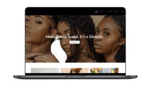
Consider a childcare center, for example: a playful and colorful design with soft pastels and playful fonts can exude the warmth and accessibility parents seek.
For a commercial marketing agency, a clean and professional design with colors like navy blue or black and a classic font like serif works.
Always tailor your design to the needs, style, and expectations of your ideal visitors for the best first impression.
To Do: it is useful to create a persona beforehand, so you get a clear picture of what your ideal customer looks like.
Tip 2: Ensure a mobile-friendly website
More than half of all website visitors now view websites on mobile devices. A design that looks good on a smartphone is therefore essential.
All Webador designs feature responsive design. This means the website automatically adapts to the screen size being used. It might be a bit of a challenge to get both the desktop and mobile versions to look good, but with a little fine-tuning, you can ensure your visitors always have a pleasant experience.
Tip 3: Keep your website simple and clear

A cluttered or overcrowded website can discourage visitors from browsing. Therefore, ensure a clear and organized menu so visitors know what’s on your site. It’s also important to include plenty of white space.
By keeping your website organized, you make it easier for visitors to find what they’re looking for, and that’s exactly what you want!
Tip 4: Make sure your design matches your corporate identity
Your website’s colors and fonts are the visual voice of your brand, also known as your corporate identity.
Think of a bakery, for example: warm, inviting colors like beige or soft yellow, combined with an elegant, handwritten font, can emphasize the artisanal feel. For a tech company, on the other hand, sleek, modern colors like blue and gray, combined with a minimalist font like sans-serif, are ideal for projecting innovation and reliability. Always ensure your color palette aligns with your logo and your fonts are easy to read on any screen size.
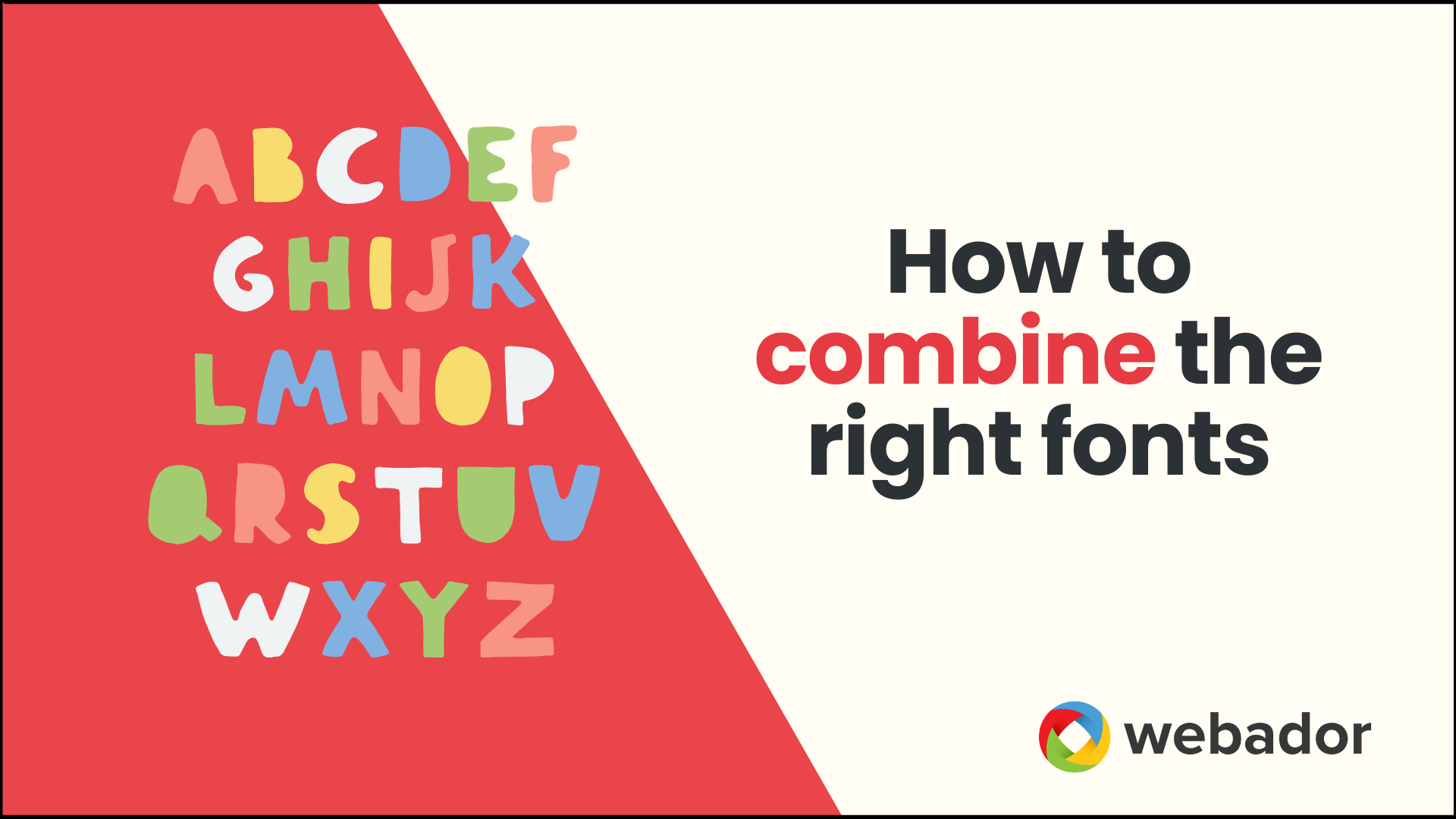
Less is more: combine a maximum of two or three fonts and colors to ensure calm and consistency
Tip 5: Test different designs
It can be difficult to choose the perfect design right away. So, try out different designs and ask for feedback from friends, colleagues, or even your clients! This way, you can discover which design works best for your website.
Conclusion
Choosing the right design for your website is therefore a crucial step in establishing a successful online presence. By considering your target audience, choosing a mobile-friendly design, keeping it simple, and reflecting your brand identity, you’ll establish a strong foundation.