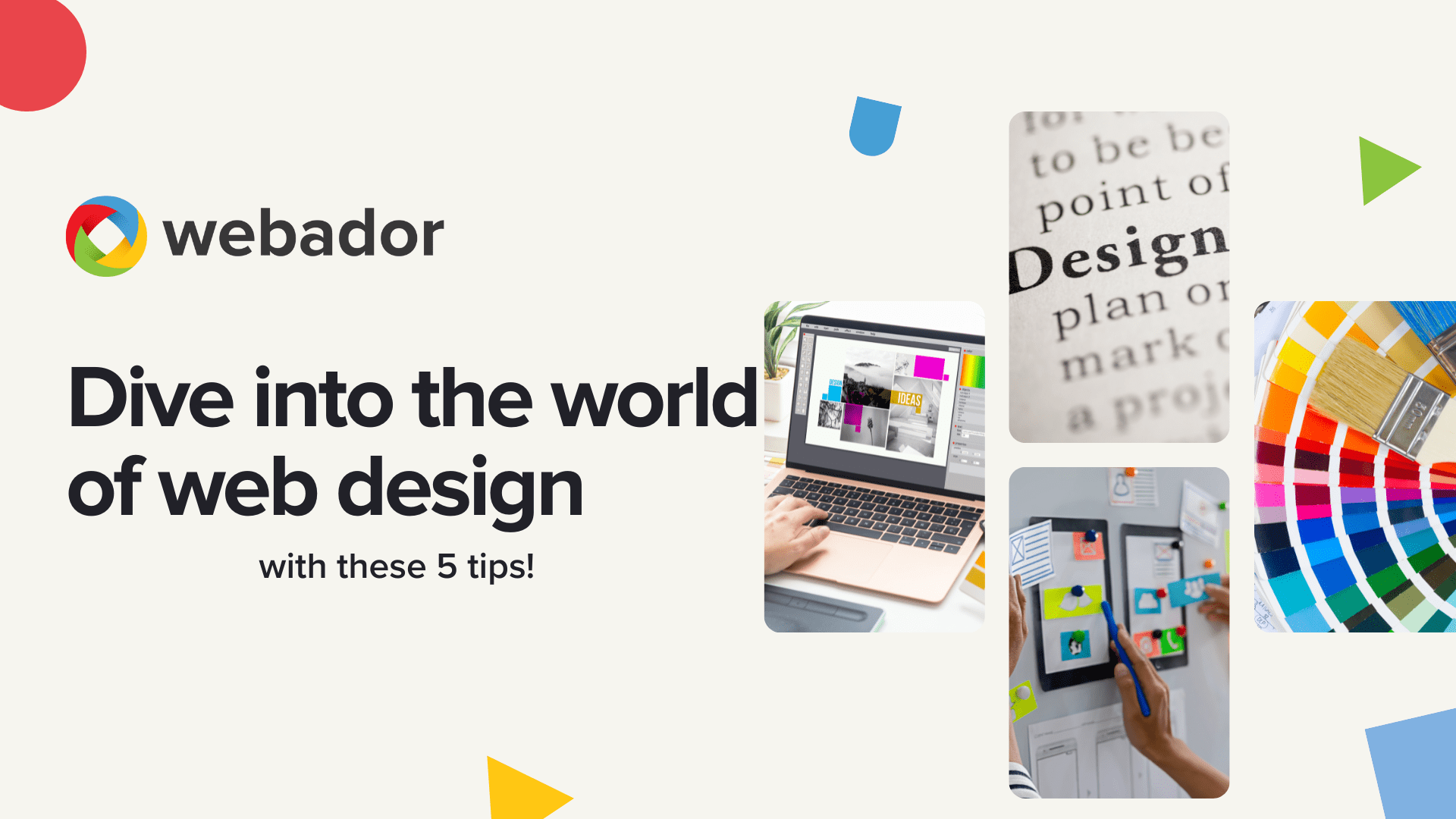
As a starting entrepreneur, you may not be a web designer, and that’s perfectly fine! But did you know that good web design is essential for the success of your online presence? A well-designed website not only attracts more visitors, but also converts them into customers.
In this blog, we dive into the world of web design and give you 5 practical tips to take your website to the next level.
Let’s start with a brief explanation of what web design actually entails. Simply put, web design is the process of designing your website or webshop. Think about the colors, fonts, page layout and overall look and feel. It’s your digital business card!
So start with these 5 web design tips for beginners!
Tip 1: Simplicity is the strength of good design
When you start designing a website, you can quickly become overwhelmed by all the elements you can put on your website. You may want to put everything on your website, from pop-ups to complex implementations. We advise against this at all times! This is a common mistake. A clear website is much more effective.
For each new element you want to add, ask yourself the following questions:
- What is my ideal visitor looking for?
- What is my visitor’s goal on this page?
- Does the element help my visitor achieve their goal?
- Does this element add value to the page?
If you answered ‘no’ to the last two questions, it might be better not to include the element on your website. A complicated website is not good for conversion and user-friendliness. Conversion is the moment when a visitor takes action, such as making a purchase or contacting you. For a successful website, keep your design simple and clear.
Tip 2: Don’t use more than 3 fonts
With so many fonts available, it’s tempting to go wild. But one of the golden rules of web design is: don’t use more than three different fonts on your entire website. Each font has its own personality, so choose one that fits your company and corporate identity.
For example:
- Do you have a business? Then go for a sleek and simple font.
- Do you have a beauty salon? An elegant font for your header would be a good fit.
One of the golden rules of web design is that when designing a website, it is important to use the same fonts on every page. Not only should the fonts be consistent, but also their size, thickness, and style. This will give your entire website the same visual identity.
Once you have chosen a font, it is important to check its readability: not only on your desktop, but also on your mobile phone. Nowadays, the majority of your visitors will be coming from mobile devices, so it is crucial to optimize your web design for this.
To maintain consistency in your web design, it is important to note which fonts you use for which purpose (for example: ‘Title: Font A’, ‘General text: Font B’).
Tip 💡: Search Google for “font combinations” for inspiration!
Tip 3: Use a color palette
Of course, you want people to recognize your website. A large part of that recognition comes from the colors used in your website. Colors give meaning to your brand and help people remember it. Think of Facebook (blue), Coca-Cola (red), McDonald’s (yellow).
To create that recognizability, choose a color palette of no more than three different colors for your website. This makes your website easy on the eye and easier to remember.
When choosing colors, it is especially important to determine what you want the website to convey. Colors have a psychological effect:
- Blue: calm & tranquility, fresh, protective, peaceful, technical, formal, businesslike, wisdom, stability, hope, reliability, infinity, cold, truth, clarity, power
- Red: action, dynamism, vitality, liveliness, romance, love, warmth, energy, power, danger, commanding, aggressive
- Green: nature, relaxation, leisure, calm, peace.
- Orange: joy, inspiring, tasty, interesting, active, warmth, stimulation, warning
- Yellow: warming, light, stimulation, clarity, cheerful, playfulness, curiosity, energy
- Purple: melancholy, luxury, intelligence, magic, vanity, artistic, spirituality, refinement
- Brown: earthy, stylish, completeness, stability, importance
- Black: authority, power, timeless, elegance, death, rebellion
- Gray: emotionless, boring, meaningless, old age
- White: innocence, luxury, simplicity, light, pure, neutral, timeless
Choose the colors that match your brand story and the emotion you want to convey!
Tip 4: Use images that speak for themselves
The saying “a picture is worth a thousand words” certainly applies to your website. The right images can set the tone and reinforce your message.
Make sure the images on your website fit your business and convey the right feeling to your visitors. The best images are your own photos; this gives a personal and authentic touch. Don’t have your own photos (yet)? No problem! Websites such as Unsplash offer an extensive library of beautiful, free, high-quality images.
Tip 5: Test how your website looks on mobile phones
We cannot stress this enough: the majority of your website visitors access your site via their mobile phones. This means that your web design must look perfect on a small screen.
In the world of web design, this is called responsive design. It means that your web design always looks good, regardless of the device used to view the website. At Webador, all designs are responsive. This saves you a lot of time! However, it is always a good idea to check your website to make sure that your page is displayed correctly on all devices.
Tip💡: Also check out our help center for tips on optimizing your mobile display!


I do not know how to upload my imges in an email to the product. Do you have a real person to guide me? If not I may have to abandon your site. My phone is 6265481734 LIu.
Hi, if you have any questions, please contact us by email at support@webador.com.
Do you have a customer service with a phone number to reach?
Hi, if you have any questions, please contact us by email at support@webador.com.
“Such a good reminder! Always think twice before clicking any links in emails. 🙏🛡️”
Thank you so much for your comment! 🙏 We completely agree — staying alert and thinking twice before clicking on email links is one of the best ways to stay safe online. 🛡️The Webador Team ✨
Great advice for small brands! Running a creative eCommerce shop is definitely a journey — I started one at Arctee.co.uk to make custom AI-inspired tees. The biggest lesson I’ve learned is how much storytelling matters in design-focused businesses.
Thank you for sharing your experience! We completely agree that storytelling is one of the biggest unique selling points for creative small brands. The Webador Team ✨
Really useful information here. Thanks for putting this together!
Hi, Thank you for your feedback, we are glad you found this blog useful 🙂 The Weabdor team
I really appreciated this post — the focus on beginning with simplicity and clearly defining visitor goals is often missed by those new to web design. The suggestions about fonts and color schemes stood out to me, as consistent typography and well-chosen colors do more than enhance brand recognition; they also boost readability on various devices. With mobile browsing so prevalent, your insights on responsive design are particularly relevant. At Digihub Group, we’ve observed firsthand how mastering these fundamentals significantly improves user engagement and conversion rates for clients launching their first websites.
Hi, thank you for your lovely comment! We asre glad you appreciated the blog and that you were able to take postive information from this 🙂 The Webador team!