When building a website or online store, you might primarily think about images, colors, and products. Yet, something you don’t immediately see plays an equally important role: the fonts you use. A good font combination ensures that your website looks professional, is easy to read, and has a beautiful appearance. Crucial to your online success!
In this blog post, we’ll guide you step-by-step through choosing and combining fonts. We’ll provide practical tips and examples that you can easily apply yourself. This way, you can get started right away and ensure your texts look their best.
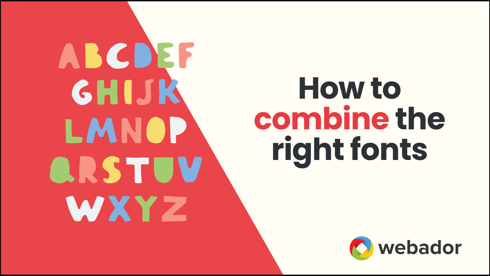
1. Types of Fonts
Before you start combining fonts, it’s helpful to know what types of fonts there are, and what each type is used for.
- Serif: These are fonts with small “feet” or strokes at the end of the letters. They are often used in classic, elegant, and formal settings. This font is good for titles, but less ideal for longer texts.
- Sans-serif: A typeface that is often uncluttered and easier to read on a screen. This is ideal for longer texts on websites.
- Decorative fonts: Think of display fonts, handwritten styles, ornate lettering, etc. These are great for visual elements or as headings on your website. Just make sure they remain legible.
Tip: Keep it simple. Choose one primary font for all your text and consider one eye-catching font for your logo and headlines.
2. The importance of font combinations
You might be wondering if using multiple fonts is actually necessary. The answer is: not necessarily, but it can give your website a lot more power.
A good font combination helps you with:
- Recognition and atmosphere: say you sell handmade jewelry — then a sleek display font for your headlines works well, combined with a clean sans-serif for your product descriptions.
- Readability and structure: different styles between headings and your general text make it easier for your visitor to scan your page
- Professionalism: An incorrectly chosen font can make visitors doubt the quality of your website.
3. What should you pay attention to when combining fonts?
There are 4 things to keep in mind when combining your fonts:
- Character & Appearance:
Ask yourself: what kind of feeling do I want to evoke? Playful, reliable, luxurious, warm? Make sure your fonts reflect that. - Structure & Hierarchy:
Ensure a clear distinction in size or style between your headings and body text. This helps your visitors quickly see what’s important. - Contrast & Harmony:
A good combination should have enough difference to differentiate, but also enough similarities to be cohesive. - Stuck? Keep it simple!
At a loss? Then choose a single font with multiple styles (light, regular, Italian, bold). This creates a sense of calm and prevents mismatches.
For example: use “Poppins Regular” for your body text and “Poppins Bold” for your headings.
4. Common mistakes
Be aware of these pitfalls when combining fonts:
- Too many fonts at once: Do you have three or more different fonts on a page? That can quickly become chaotic! Stick to a maximum of two fonts.
- Decorative font as body text : No matter how beautiful a decorative font is, if your font is difficult to read, visitors will quickly drop out.
- No attention to mobile: Always test whether your fonts are also easy to read on the mobile version of your website.
- Lack of consistency: Use the same font combination on every page. This creates cohesion and recognizability.
A well-chosen font combination may be subtle, but it can have a big impact. It increases readability, creates recognition, and creates a professional look.
Ready to apply these tips to your own website? Get started now!