These days it’s really important to optimize your website for mobile devices, because a lot of website traffic is generated on mobile. A well-optimized website will also rank higher in Google search results.
But isn’t it difficult to optimize a website for mobile? Not if you’re using Webador! All Webador websites have responsive design, which means the website adapts to the size of the screen on the device being used. This means your Webador website will automatically adapt to display better on mobile
Even though all Webador websites are responsive, we do have a few tips to share so you can ensure your website looks its best on mobile.
Tip #1: Columns
To place multiple elements next to each other on your website, you can use the Columns element. These columns are displayed vertically on mobile.
Adding the Columns element to your website will add three columns to your website by default. You can placing content, such as text or images, in the columns by dragging and dropping elements into the spaces.

One common mistake is adding a new column element for each content (text, image) element. Of course, this is not how your website should look on mobile.
To avoid this problem, it’s important to place all elements that belong in a column in one column. This will ensure the content displays as intended on mobile.
Tip #2: Tables
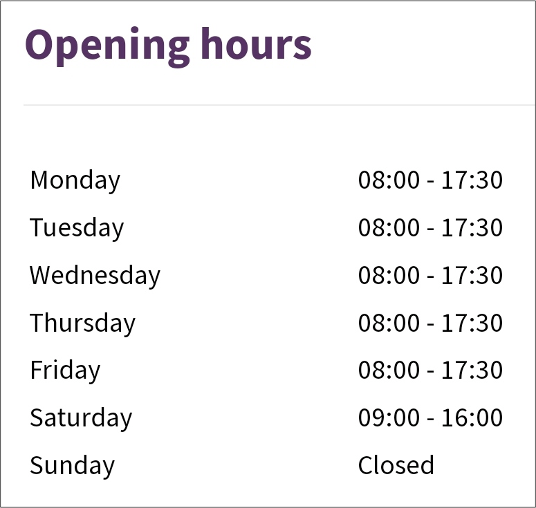
If you want to add opening hours or a menu to your website, the Table element is an ideal option. To display opening hours, you’ll of course want the days and times shown neatly alongside each other even on mobile.
Because columns are displayed vertically on mobile, opening hours aren’t clearly visible if you use the Columns element. This causes the hours to be shown under the days, rather than alongside.
However, if you put opening hours in a table, you’ll see that they’re displayed correctly on mobile.
Tip #3: White space
An important component of a good mobile website is the use of white space, which helps prevent elements from being too close together.
To create some white space between columns on mobile view, it’s important that the White space element is added under each individual column, rather than under the entire Columns element.
Why? If you add the Whitespace element below the Columns element, only the very last element at the bottom will have white space. If you add the Whitespace element under each column, your website will look perfect on mobile.
Tip #4: Alignment
If you use columns on your website, remember to take into account the alignment of these columns on mobile.
A common mistake is to left-align elements in the left column, center-align those in the middle column, and right-align elements in the right column.

This looks fine when viewing your website on a computer, but not so great on mobile, as you can see below.

So, to avoid this, align the elements in your columns in the middle.

Tip #5: Test your website
A very important tip! Test your website using the mobile view function in the Editor. When you’re building your website, it’s important to regularly check how it’s looking on mobile.
One mistake many people make is building their website to completion before optimizing it for mobile. By regularly checking mobile view and making adjustments where necessary, you can make sure your website is fully optimized for mobile when you launch.
Do you want to build and publish your website within 10 minutes? Sign up with Webador today and get started.