Visitors to your website will find what they’re looking for more quickly if your website menu is easy to navigate. In this article, we’ll share 5 practical suggestions for improving your website’s menu.
But first… what’s a website menu?
What is a website menu?
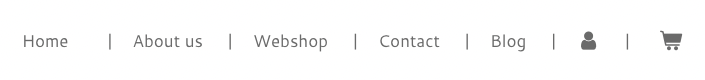
There are several links at the top of every website, which form the menu. When clicked on, these links will direct you to the page you want to view. This is what forms your website’s menu. As the menu is such a crucial component of your website, its layout should be well thought-out.
Let’s take a look at some suggestions for enhancing your menu.
Tip #1: Keep it simple
One of the best pieces of advice we can give you is to keep your menu as straightforward as possible. We frequently come across websites with menus containing more than 12 pages, which make navigation and finding the right page much more difficult for visitors.
Of course, it’s not a bad thing to be enthusiastic about sharing as much information as possible and getting your product or service out there. However, too much at once can overwhelm visitors and even cause them to leave your website.
Keep in mind that many of your visitors are landing on your website for the first time ever. They need to learn more about you, which can take time.
To maintain a simple and clear overview, try to limit the number of pages featured in your website menu to between 5 and 7.
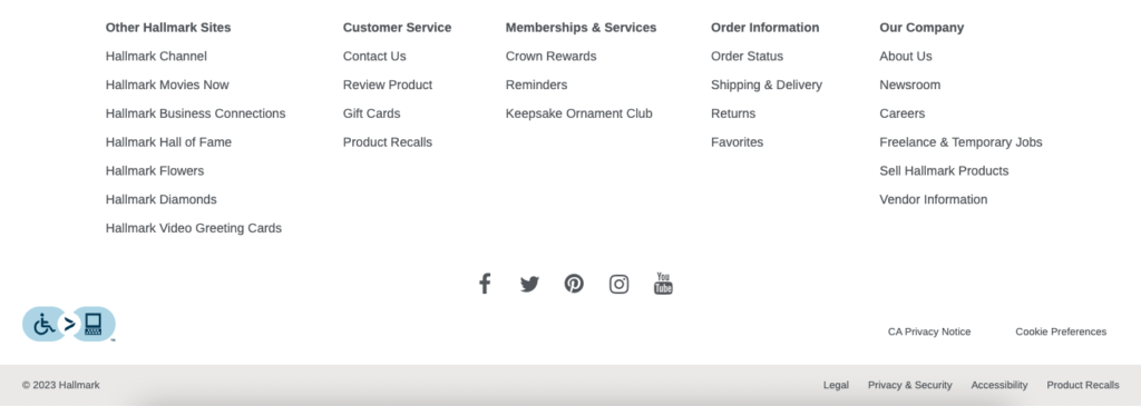
What are you going to do with all of those other pages? You can add them to your footer, for example. Examples of pages that are commonly found in footers (not menus) include Terms and conditions and Privacy policy pages.
Tip #2: List the right pages
You may be wondering which pages belong in the website menu. Fortunately for you, the answer is pretty straightforward:
What does your ideal customer want from you?
It’s important to fully place yourself in the shoes of your visitors in order to understand what they’re looking for. Consider the following questions:
- What am I interested in reading or looking at?
- Which pages would you recommend I check out?
- How can I get the information I need as quickly and easily as possible?
These questions will help you determine which pages need to be more readily available. Take into account, for example, About us, Services, Webshop, Contact.
Reviews you’ve collected from satisfied visitors or customers should be displayed in the footer menu at the bottom of your website.
Tip #3: Avoid using the wrong language
Almost every industry or profession has its own vocabulary. Even if you find certain terminology to be quite obvious, your visitors may find it difficult to understand. These statements are referred to as jargon.
For example: in response to your visitor’s search for “lose weight,” you provide a “ketogenic diet.” You understand what a “ketogenic diet” is, but your visitor doesn’t.
Visitors will find what they’re looking for much more quickly and easily if you eliminate jargon and complex terminology, and tailor your language to your target audience.
Tip #4: Show where someone is
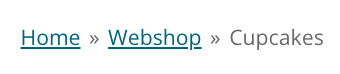
A good online experience includes letting users know where they are on your website. This information helps visitors more easily navigate to other pages they want to view.
The page you are currently viewing is highlighted in bold in your Webador website’s menu. This means your visitors can always see which page they’re currently on.

It’s also possible to enable breadcrumbs for sub-pages with our website builder, which is used to show the visitor the path they’ve taken to the page they’re on. Very useful!
Tip #5: Add a Call to Action
Including a “call to action” in your website’s menu is a great way to improve it. A call to action is a technique used to persuade the visitor to follow through with an action.
This can involve, for example, sending a request for pricing information, or making an appointment. Alternatively, offering a free resource for download can be a persuasive gesture.
This call to action is always accessible to your website visitors thanks to its place in the main menu. This keeps visitors motivated to follow the steps you want them to take, which can improve conversion.
Conclusion
These were our 5 most helpful tips for improving your website’s menu. Keep it simple, avoid jargon, make sure visitors know where they are, and provide a call to action. Which suggestions will you implement?


Very concise and solution-oriented blog. This is called helpful content that Google always seeking.
Thank you so much for your kind words! 😊 We’re glad you found the blog helpful 🙂
The Webador Team