Choosing a color palette for your website is a key aspect of the design process. Good color choices ensure a pleasant experience for your visitors, while using the wrong colors can cause visitors to become overwhelmed and leave your website.
In this article, we’ll explain the basics of color theory and share some practical tips to help you choose the right colors for your website. By the end of this post, you’ll know how to select a color palette that conveys your brand identity and helps you stand out from the crowd.

Step 1. Learn about color psychology
There’s much more behind the use of color than you might think, and the colors on your website can absolutely influence visitor behavior.
Research shows that colors impact the emotions we experience, which in turn affects our behavior. Certain colors evoke specific emotions such as confidence, happiness, and even gloom.
In general, warmer colors such as red, orange, and yellow create a more exciting effect, while colder colors such as blue and green exude a calmer feeling. By understanding color psychology, you can influence your target audience!
You’ll start by choosing a primary brand color, which can also be used to build brand recognition. Webador’s primary brand color is blue, for example, and this is clearly reflected in our corporate identity. Other examples include Coca Cola (red) and Yahoo (purple).
Once you’ve selected a primary brand color, you can supplement it with 1 or 2 accent colors and a complementary color. We’ll talk more about accent colors and complementary colors in the next steps.
To help you choose a primary color, think about which feelings you want your visitors to experience. Here’s a list of colors and the emotions they usually represent:
1. Yellow: Luck, optimism, happiness, friendliness, light, sunshine
2. Red: Power, warmth, danger, aggression, impact, passion
3. Orange: Creativity, friendliness, warmth, fun, passion
4. Green: Growth, nature, youth, health, balance, sustainability
5. Blue: Calm, peace, patience, reliability, stability, authority, sadness
6. Purple: Luxury, quality, spirituality, creativity, wealth
7. Pink: Love, romance, femininity, grace
8. Black: Strength, quality, wealth, status, prestige, elegance
9. Gray: Balance, security
10. White: Cleanliness, sustainability, minimalism, simplicity, purity, clarity
Step 2. Choose the best colors for your website
Once you’ve learned a bit about color psychology and chosen your primary brand color, it’s time for the next step: selecting accent colors.
Keep in mind that you’ll want to use these accent colors throughout your house style – so on your website, your social media, and your marketing materials. Again, this helps build brand recognition.
Choosing one or two accent colors is also important because you can’t effectively design a website around a single main color. Accent colors allow you to highlight and draw attention to certain aspects of your website.
You can use accent colors that are close to your primary brand colors. If your primary color is green, for example, you can opt for one or two lighter shades of green as accent colors.
Once you’ve selected your accent color(s), the next step is choosing a complementary color. These are colors that are opposite your primary brand color on the color wheel.
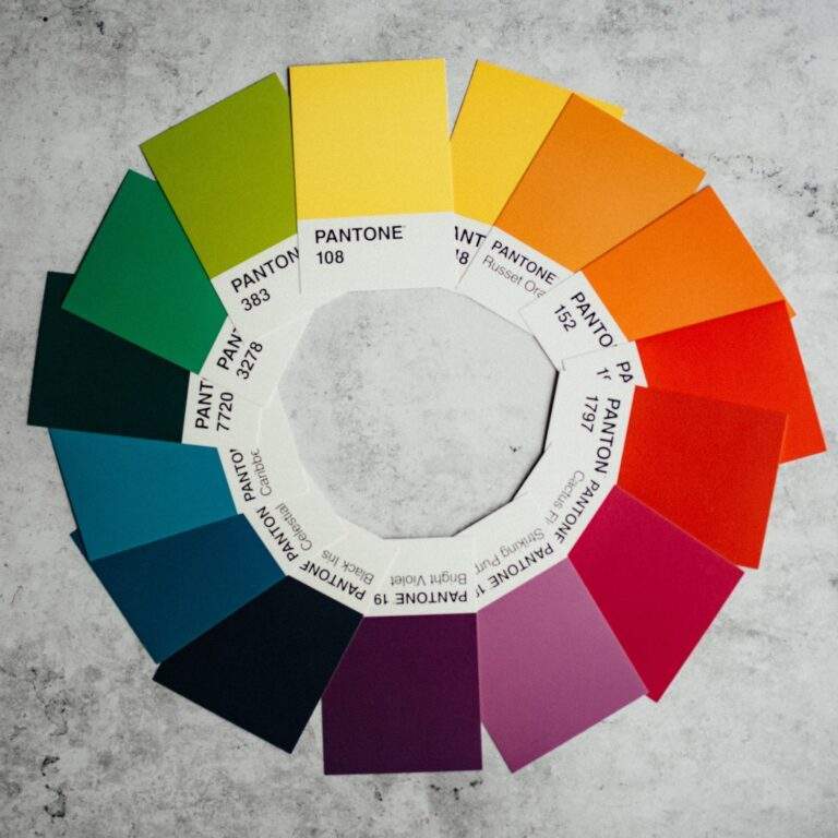
If green is your primary brand color, you can select orange as a complementary color. Complementary colors can be used to highlight, for example, buttons on your website.
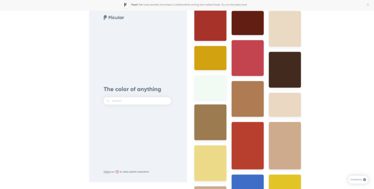
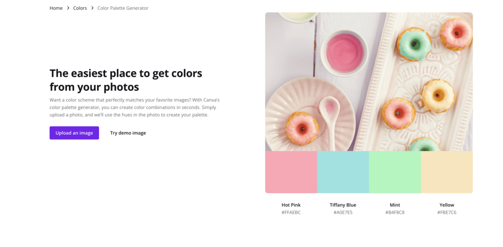
If you’re looking for some inspiration, Picular is a handy color selection tool. Simply type in a word (e.g. “sustainable” or “luxury”) and the tool will automatically put together a color palette for you. Another great tool is Canva, which allows you to upload an image and automatically generate a color palette based on the colors in the image.
Step 3. Use the colors you’ve picked
You may be asking yourself, “okay I’ve got my primary brand color, my accent colors, and my complementary color… but what do I do with them?”
Let’s look at how to apply the color palette you’ve put together.
Your website background
When designing your website, keep the background white at all times (in some cases, black is also an option). We often see website owners experimenting with different colors for their website background. However, doing this can distract from the message you want to convey to your visitors.
The golden rule of web design is to keep the background white and use black text.
Buttons on your website
Of course, your website has a goal, for example to sell products or give customers a way to contact you. Whatever the goal is, it’s important to make sure your visitors know what to click on. If this is unclear, visitors will leave your website.
The color you’ll use for your website buttons is the complementary color. Going back to our example, we chose green as a primary brand color and orange as a complementary color. Using orange contrasted with green helps ensure the buttons stand out.
Your primary brand color and accent colors
Your website has a top section (header) and a bottom (footer). You can incorporate your primary brand color and accent colors in these sections to give your website the right look and feel. With Webador’s Editor, you can adjust this in just a few clicks:
Case study: Use of color in website design

Mailchimp
Let’s take a look at Mailchimp’s branding. This marketing platform chose yellow as its primary brand color, which radiates optimism, happiness, and enthusiasm. This fits well with the logo, a cheerful-looking monkey.
Mailchimp uses yellow throughout their website and marketing materials. Their complementary color, used for the buttons on their website, is a blue/green hue.
Conclusion
Once you’ve dived into color psychology, choosing the right colors for your website design is simply a matter of selecting colors that will convey the right message to your ideal visitor or customer.
It’s important to keep color use consistent throughout your website, as too many different colors can be confusing. Remember to also use lots of white, as this will help keep your page content organized.
If you need help getting started, check out our Pinterest boards for a healthy dose of color inspiration!
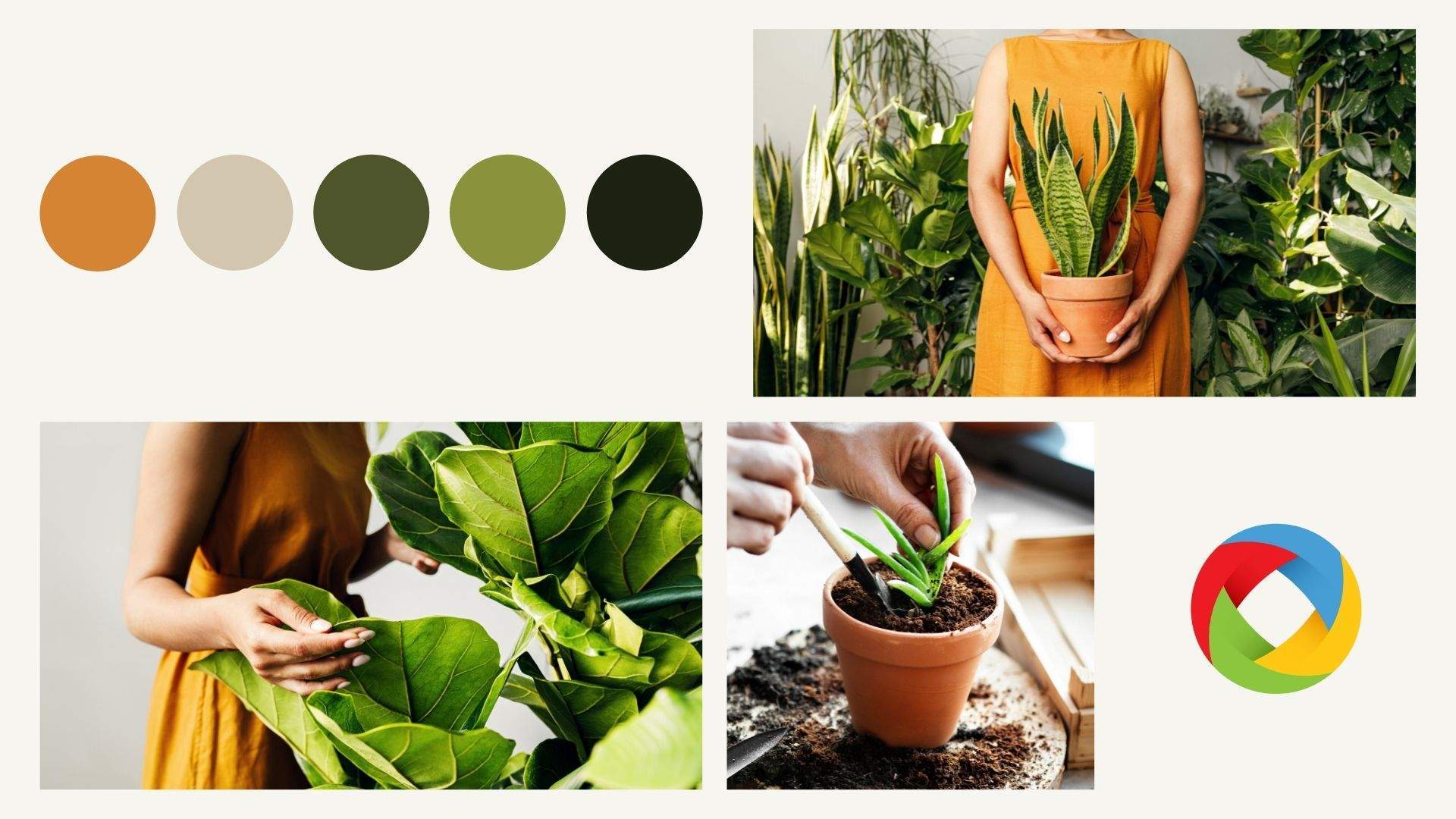


Colors in website design aren’t just about aesthetics; they influence user emotions and actions. From calming blues to vibrant reds, the best website design agency dallas knows how to use color psychology to create impactful online experiences.
Hi Reikar. Indeed! We completely agree with you. There’s so much to consider in the design of your website. ^Charlene